APOLLO
Client: Apollo Ridge Design
Industry: Design and Media
Tools: Photoshop, Illustrator, After Effects
Status: Ongoing
Where do you begin when building a new brand? So many thoughts and worries at the same time can become overwhelming and exciting, but with a solid understanding of your services or product, your ideal audience, and a bit of creative wisdom, the process easily flows down onto paper.
With more than 15 years of experience developing creative assets, brands and more, we were confident that our combined skillsets would lead us in a direction that established Apollo Ridge Design Group as a trusted agency in the creative market. Understanding that brand recognition takes time, we wanted to ensure that our image immediately expressed to potential clients a sense of trust, understanding, and passion so that they knew where to turn for creative ingenuity.
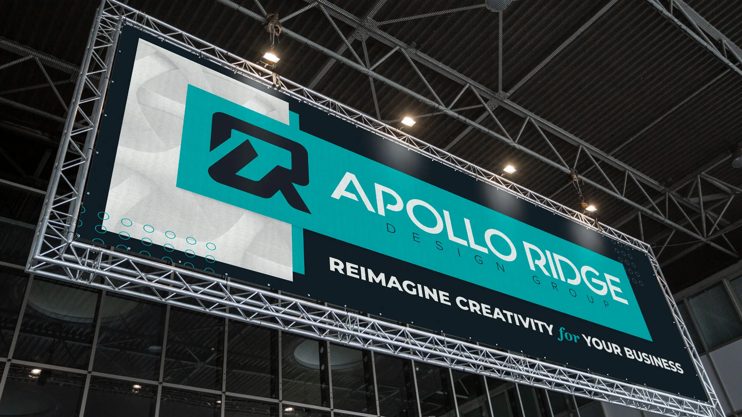
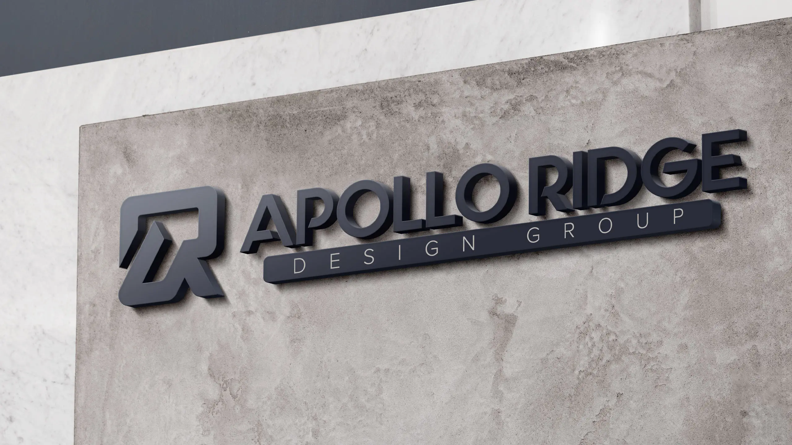
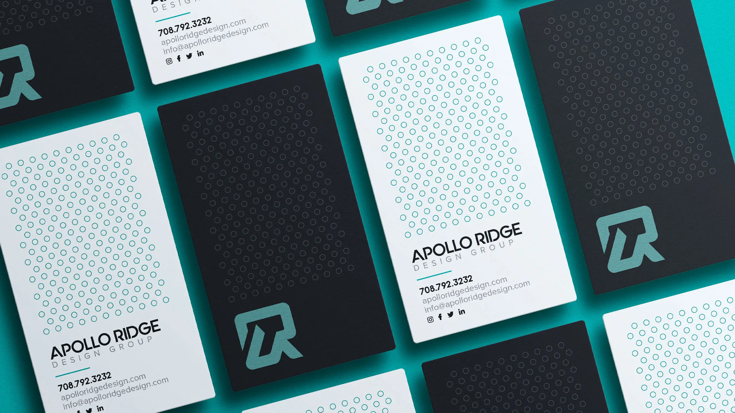
When we sat down to start sketching out ideas for logos, colors, branding, shapes, patterns and more, we wanted to develop an identity that reflected our personal passions as well as our company mission. The central focus to our unique mark was to incorporate a sense of movement and to express our ability in helping individuals and brands propel their image forward through creative design and development services. Throughout the process we developed a handful of potential icons but continued to come back to the concept of combing upward momentum, a likeness to an A and R, and a unique outer shape that scaled well across all platforms and outlets. Most of all, we wanted to ensure the icon was recognizable both with and without the company name attached.
Next up was selecting a typeface, which in an of itself is a difficult task for any corporate identity project. With thousands and thousands of options available on the market, we wanted to ensure a pair was made that combined clean lines with substance, honesty, trust and professionalism. The sharp edges found in the primary name share similarities with those found in our icon while the clean lines in the secondary line provide balance and uniformity to the complete package.
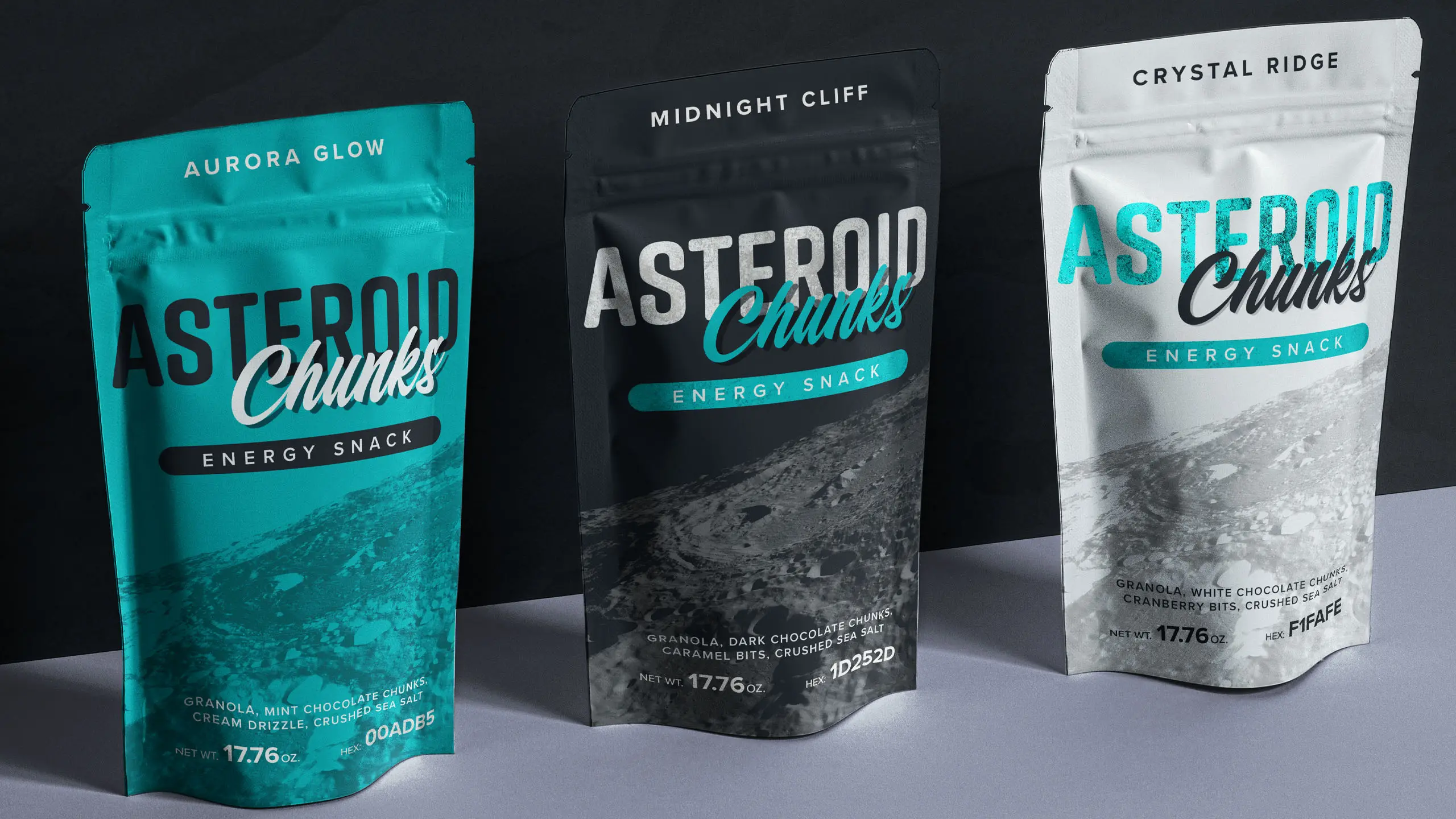
Finally we arrived at the color pallete. Billions and billions of combinations to choose from make this an arduous, yet very exciting and energy driven portion of the development process. Colors play a vital role in how your brand or product is perceived in the market. Do you want to reflect strength and rigidity? Soft and friendly? Fun? Entertaining? The choices truly can be endless, but the most important decision lies in selecting the right palette to leave a lasting impact on a client or audience. For Apollo, we chose to go with Midnight Cliff, a dark navy, as the foundation to build on. We added Aurora Glow, a modern mix of teal and mint to help bring life and energy to the brand. And finally we landed on Crystal Ridge, an icy white, to help provide contrast against the dominating teal and navy.
Total number of hours our creative team has spent developing assets for brand and products across the nation. Our name may be new, but we’ve been designing since 2005!